Customize shop page content and ordering
- Availability
- Beta
- Last verified
- Last verified Oct 29, 2026
Use this when the online shop should show different content, a different offer selection, or a different order than the default pages. Shops with the Page Builder compose pages from content blocks; other shops use the simpler Pages tab.
Before you start
Prepare the page structure you want, the offers or tags each list should show, and any images or text blocks. The classic editor applies changes to the live shop with Save. The visual editor saves a draft automatically; use Publish changes when that draft is ready for customers.
Edit a page in the Page Builder
- In the back office, open Shops, select the shop, and open Page Builder.
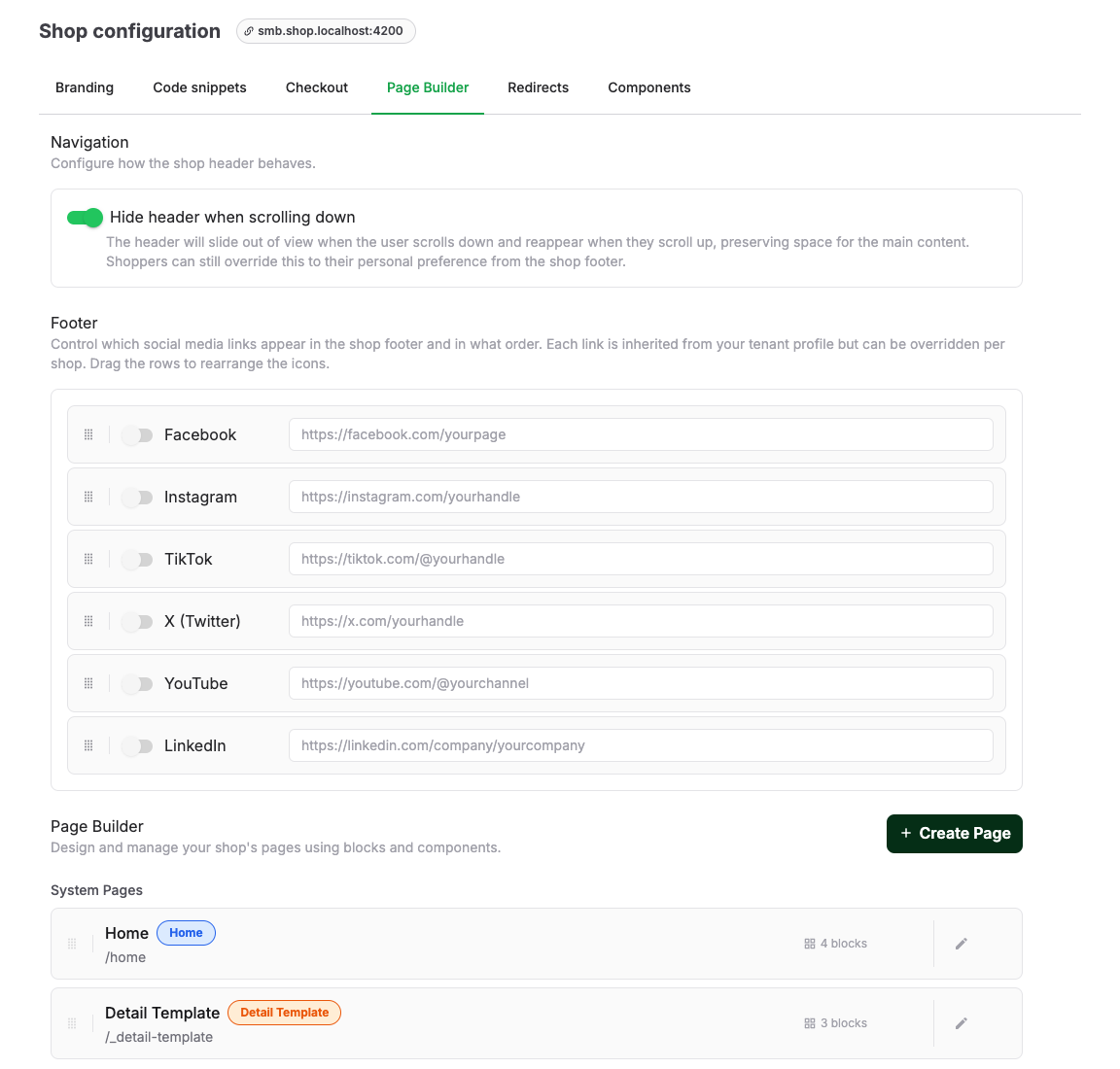
- The list groups System Pages (Home, the general Detail Template, and any custom detail templates beneath it), type pages such as Events or Products, and Custom Pages. Select Edit on a page, or Create Page with a Page Name and URL Slug for a new custom page.
- Under Page Settings, control the page's URL Slug, whether it is Enabled, Show in navigation, and the SEO & Meta fields. Custom detail templates instead have Applies to beneath Enabled. The shop menu order follows the page order in the Page Builder list.
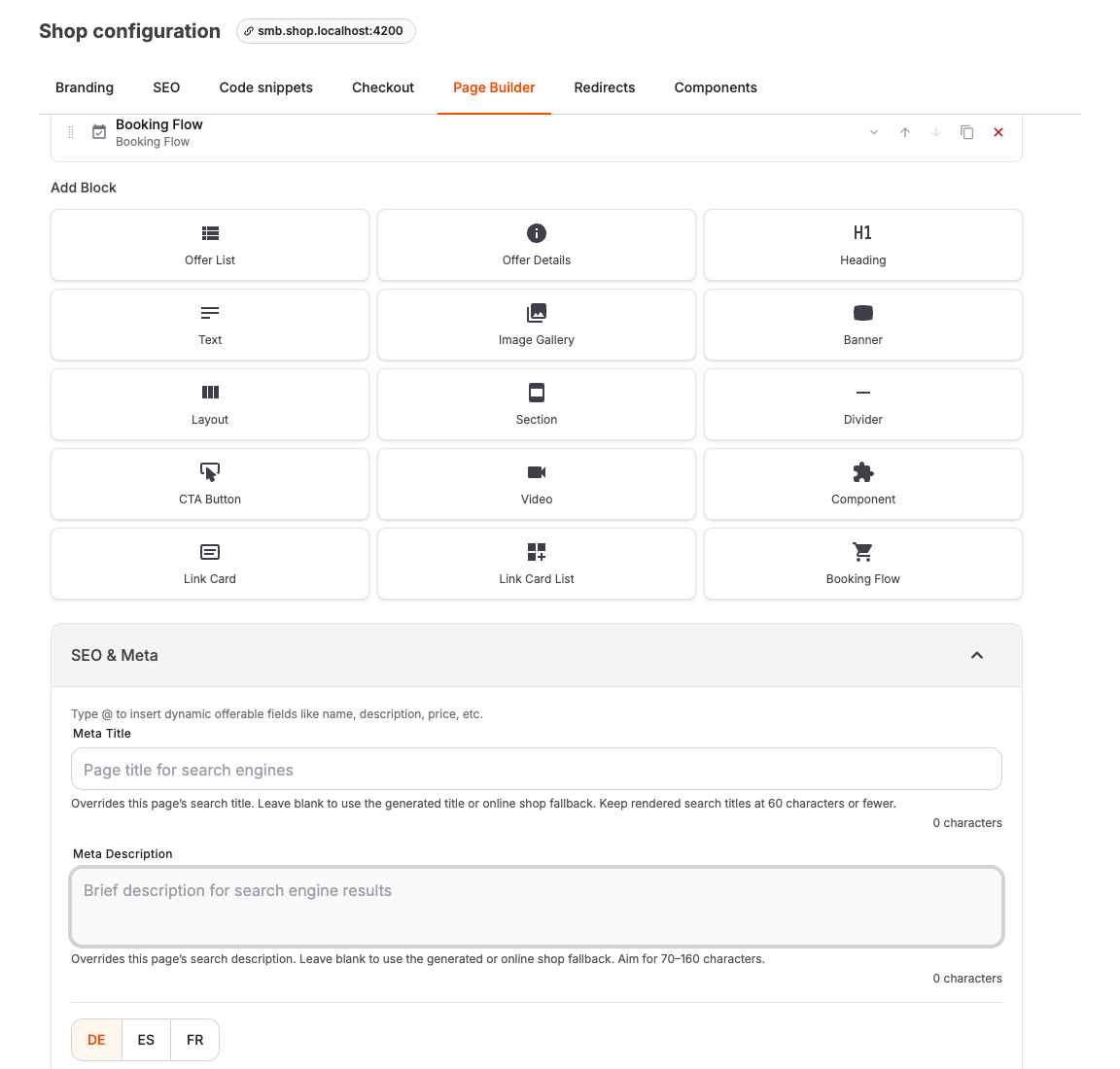
- Under Content Blocks, select Add Block and choose a block type: Offer List, Heading, Text, Banner, Layout, Section, Divider, CTA Button, Video, Image Gallery, Link Card, Link Card List, Component, and detail-page blocks such as Offer Header, Offer Details, and Booking Flow.
- Use the summary below each block type to identify its configured text, image, offer type, component, or nested blocks without opening every block. Longer sections, layouts, and card lists show the first entries and the number of additional items.
- Reorder blocks with Move up, Move down, Move to top, Move to bottom, or by dragging. The top and bottom actions move a block within its current container. When dragging through a long page, hold the pointer near the top or bottom edge of the content area to scroll. To remove a block, select Delete block. The block is removed immediately; select Undo in the confirmation message to restore the complete block to its previous position.
- Use Preview to check the result, then select Save.
To add a block inside a Section, Layout, Offer List, or Link Card List without dragging, right-click an empty block drop area and choose a block from Add Block. The menu offers block types that the area accepts. You can also focus the drop area and press Shift+F10 or the Context Menu key.
Edit the heading above an offer list
On a page such as Events, the visible title above the offers is a Heading block. Select it under Content Blocks, or under Layers in the visual editor, to change its text, translations, or heading level. Edit this block to change the customer-facing title; Page Name identifies the page in its settings. You can move or remove the Heading separately from the Offer List. Adding a Heading to a page with one automatic Offer List does not change its filtering or pagination.
Set search and sharing details for the page
Expand SEO & Meta to override the generated search title or description, add a 1200 × 630 social sharing image with translated alternative text, or choose a page-specific indexing rule. Character counts and warnings help keep titles to 60 characters or fewer, descriptions near 70–160 characters, and alternative text to 125 characters or fewer. Leave a title or description blank to use the generated value or the online-shop default.
On the Detail Template, type @ in the title or description to insert dynamic offer fields. The description supports multiple paragraphs; the resulting metadata contains readable plain text rather than editor markup.
Show different content on selected offer details
The general Detail Template is the fallback for offer detail pages. To use different blocks for selected offers:
- In Page Builder → System Pages, select Add detail template under Custom detail templates. Give the template a name that your team will recognize. It starts with a copy of the general template and remains disabled until you assign it.
- Open the new template and use Applies to. Under All offers of these types, add each type that should use it. Under These specific offers, add as many individual offers as needed. The choices are additive: selecting Products and two particular Events applies the template to every Product and those two Events.
- Select Save. If a type or offer already belongs to another custom template, review the conflict and select Move targets here only if you want to transfer it. An individual offer assigned to one template takes priority over a type assignment to another.
- Edit the blocks and choose Preview as to see the template on a real offer URL. When it is ready for customers, switch on Enabled and select Save in the classic editor. In the visual editor, select Publish changes; enable the template in Page Settings. A template needs at least one type or individual offer before it can be enabled.
Arrange a booking button and a voucher link in the classic editor
On a template that targets Events or Admissions, add a Section to the detail page and place Booking Flow, Text, and CTA Button inside it, in that order. Enter “or” in the Text block; its formatting and alignment are set in the text editor. Configure the CTA Button as follows:
| Setting | Choice for this example |
|---|---|
| Link Target | Shop page, then select the Vouchers page. |
| Button Label | For example, “Give as a gift voucher”. |
| Style | Secondary if the booking button should remain the primary action. |
| Button width | Fill available width. |
| Button alignment, Button text size, Button text weight | Adjust these for a button that fits its label or to match the shop's design. Alignment applies when the width is Fit label. |
In Booking Flow, set Booking button width to Fill available width. In the Section's Layout, choose Narrow for Content width, set Horizontal alignment to Center if the actions should be centered, and choose the Space between blocks that looks right. Narrow gives the booking and CTA buttons a shared width; on product and voucher details, the price and quantity fields can remain wider than the buttons. Use Preview as with an assigned offer, then Save. The CTA opens the Vouchers page in the customer's shop language. Voucher details continue to use the general template unless you assign them separately.
You can also open an offer's SEO tab and choose a Detail template for that one offer. Automatic uses the matching type template or the general template. The selected template and the reason it applies are shown beside the selector. Disabling or deleting a custom template returns its offers to the next matching template without changing their shop URLs.
Show a block only in a chosen context
Open a block's Visibility settings in the classic editor or the visual Inspector. Select Add condition, then choose an offer type, specific offers, a shop page, a shop language, whether an offer list has items or more results, a URL parameter, or URL contains text. You can select several types, offers, pages, or languages in one condition. Does not match reverses one condition. With several conditions, choose whether All conditions match or Any condition matches. Leave the list empty to always show the block.
For a link such as /de/events/t/ET1?kombitickets=true, choose URL parameter, enter kombitickets as Parameter name, and true as Exact value (optional). You can use that URL as a Link Card target; the condition checks it when a visitor opens the destination. Leave the value empty when the parameter only needs to be present. Use URL contains text to match a specific piece of the path or query string, such as /events/t/ET1. Matching is case-sensitive; the domain and fragment after # are ignored. A URL condition applies only while that text or parameter is in the current URL. Visibility controls displayed content, not who can access a page or buy an offer.
To switch between two groups of content, use a Section for stacked blocks or a Layout for columns. Set the first container's rule and select Add alternate content. A new container of the same type appears beside it with the opposite rule and no content; a new Layout keeps the original column count. Add the alternative blocks there. The visual editor labels the adjacent pair If and Otherwise in Layers and on the canvas. A hidden Section or Layout also hides everything inside it. Rules that refer to an unavailable offer, page, or list do not show content in the online shop.
In the visual editor, a Visibility badge identifies configured blocks under Layers. Select Show hidden blocks to keep hidden blocks available as placeholders in the canvas while editing. Use the preview offer and language controls to inspect each intended context. Enter kombitickets=true under Preview URL parameters to check a URL condition. In the visual editor, select Apply URL parameters to refresh the canvas; in the classic editor, select Preview. Clear the field to check the default view. When the page contains an offer list and a visibility rule, set Preview list state beside Preview in the classic editor or under Preview as in the visual editor. Choose actual results, more results, some results, or an empty list. This simulates the list state for visibility conditions in preview; it does not change the list's offers. Save or publish the changes when they are ready.
Edit the page visually
For a complete walkthrough of Layers, Canvas, Inspector, nested blocks, visibility, preview modes, and draft publishing, see Edit a shop page in the visual editor.
Open Visual editor from the page editor. The preview requires a shop domain. For a Detail Template, at least one shop offer with a shop URL must use that template.
- Select a block in the shop preview or in Layers. Use the Inspector for the block's full configuration. To edit supported headings, text, banner titles and subtitles, button labels, or Link Card text directly in the preview, double-click the text or focus it and press Enter. Press Enter to apply the edit or Escape to cancel it. In multiline fields, use Shift+Enter for a line break. The preview language determines which translation you edit.
- Add a block from Add Block at the bottom of Layers, or drag it to a position in the preview. You can collapse Add Block to give the layer list more space and expand it again from the bottom of the pane. Right-click an empty drop area in the preview or Inspector to choose a block from Add Block there. Move existing blocks by dragging in Layers or with the selected block's drag handle in the preview. Drop indicators show the insertion position or destination container.
- For precise changes, use Move up, Move down, Move to top, and Move to bottom in the selected block toolbar, or Parent container in the Inspector. The top and bottom actions move a block within its current container. Page root moves a block out of its container. Destinations depend on the block type: for example, a Link Card List accepts Link Cards, and a Layout cannot contain another Layout, Section, or Component. If a drop is rejected, choose another position or container.
- Use Undo and Redo to reverse or repeat additions, deletions, duplication, text and settings changes, or moves. The history belongs to the current editor session and is cleared when the editor reloads. Outside text fields, Ctrl/Cmd+Z undoes a page change; Ctrl/Cmd+Shift+Z or Ctrl/Cmd+Y redoes it. Inside a text field, use its text-editing undo behavior.
- Check the layout with Desktop, Tablet, and Mobile, and switch preview languages to edit translated content. Resize or collapse Layers and Inspector, or expand the canvas to full screen for more preview space.
- Wait for draft saving to finish. Unpublished changes indicates that the page still has a draft that customers cannot see. You can leave and return to continue editing without changing the live page. Select Publish changes to make the draft visible to customers. Edits made while publication is in progress remain a draft for the next publication.
Continue after navigation or a preview error
Following a shop link in the preview can leave the page you are editing. The warning explains that the current page's blocks are no longer visible. Select Refresh preview to return, or Edit this page, when offered, to switch to the page shown in the preview.
If the preview is blank or blocks cannot be selected, use Refresh preview. If the warning remains, sign in again and reopen the editor. If Draft save failed appears, keep the editor open and use Refresh preview in the preview toolbar to retry saving before leaving or publishing.
Control which offers a list shows, and in which order
In the classic editor, open the configuration of an Offer List block:
- Offer source: Automatic list shows offers from filters and ordering rules; Manual selection shows only explicitly selected offers in the order you arrange them.
- For automatic lists, choose the Types (Events, Admissions, Products, Vouchers), optional Tags, and Offer Filters to narrow the selection.
- Order by sets the card order: Field (Position, Name, Created at, Updated at, or Start date) and Direction. With Start date, dated offers come first and undated offers follow.
- Limit and Grid columns control how many cards appear and the layout. On a dedicated page with one automatic Offer List and optional Heading blocks, Limit is the number of offer cards loaded per page. If more offers match, customers can continue with the pagination controls; the remaining offers are not hidden.
- Columns per offer card sets the same width for every offer card in an Automatic list; individual offers cannot have a different span. With Manual selection, set Cols separately for each selected offer. The value cannot exceed Grid columns. Cards remain one column wide on phones.
- Offer image aspect ratio applies to all offer cards in this list, whether the offer source is automatic or manual. Auto follows each card's column span: a wider card has a wider image frame on larger screens, while its frame is square on phones. Choose 21:9, 16:9, 4:3, 3:2, or 1:1 to keep that image shape on every screen size, including phones. Images fill the frame and may be cropped, so use a landscape image for a landscape ratio. Choose No image to show the offer details and price without an image frame. This setting does not change Link Cards in the list.
- Toggles: Show prices on offer cards, Show quantity selector on product and voucher cards, Show "View details" button, and Show filter bar on shop, which lets customers filter the list themselves. The quantity selector setting is on by default. Turn it off to remove the entire quantity and cart row from product and fixed-amount voucher cards. Customers can open the offer details to choose a quantity and add it to the cart. This setting does not change event or admission cards, or quantity selection on offer detail pages.
- When the filter bar is enabled, Date filter display controls how customers choose a date. Monthly calendar loads one visible month at a time and shows the number of matching offers on each available day; use it for longer schedules. Date dropdown loads all available dates into one list and remains the default for existing blocks.
- Drag Link cards in grid into the list to mix promotional cards into the same grid.
After selecting an offer for Offer Details or Manual selection, review any warning below the picker or beside a saved offer. Select Open offer in the warning to review its settings in a separate tab. An unpublished offer cannot appear in the online shop; an offer scheduled for publication appears only after its publishing date. Hide from shop excludes an offer from manually selected Offer Lists and search. It also prevents a manually configured Offer Details block from resolving that offer. Turn the setting off if the offer should appear in either block. A published hidden offer can still be opened on its own page by direct link.
If one offer needs a different width while the list remains automatic, add a Link Card under Link cards in grid. Set its Link URL to that offer's shop page, choose the card's text and image, and set its Cols. This creates a separate link card, not an offer card: it does not automatically show the offer's price or availability, and the offer may still appear among the automatic results. Use Manual selection if you need that offer to appear only once as an offer card with its own width.
For each Link Card, whether it stands alone or sits in a Link Card List or Offer List, choose Link card image aspect ratio on the card itself. Auto follows the card layout. Choose 21:9, 16:9, 4:3, 3:2, or 1:1 to keep the image frame in that shape on every screen size. Images may be cropped to fill the frame. No image shows the card text without a frame; any uploaded images stay saved if you switch back to an image ratio later. This choice is independent of the Offer List's Offer image aspect ratio.
Let customers filter a list
Show filter bar on shop works on any automatic Offer List, including lists that mix offer types and lists that sit on a page next to headings, banners, or other blocks. The filter bar appears directly above that list's cards, and only the offers in that list are filtered.
Which controls customers see depends on the Types you selected. A control appears when at least one selected type supports it:
| Selected type | Guests | Date | Category |
|---|---|---|---|
| Events | Yes | Yes | Yes |
| Admissions | Yes | Yes | Yes |
| Products | No | No | Yes |
| Vouchers | No | No | No |
For a mixed list, such as Events plus Products, customers get the guest and date controls from Events plus the category control shared by both. Offers without a date, such as products and vouchers, stay in the results when a customer picks a date, so a mixed list never empties out just because part of it is undated.
If a page has more than one filterable Offer List, each list gets its own filter bar and its own web address parameters, so filtering one list leaves the others untouched.
Without the Page Builder: the Pages tab
If your shop has a Pages tab instead:
- Navigation controls header behavior: Hide header when scrolling down and Enable shop search.
- Landing page banner adds a banner with text, colors, and images, switched on with Activate banner.
- Shop pages lists the built-in pages (Tickets, Events, Products, Vouchers). Use Activate this page to enable a page and Display the filter bar underneath the page title to give customers a filter bar.
If your shop has both editors, Display the filter bar underneath the page title and the Offer List block's Show filter bar on shop stay in sync: changing either one updates the other, so the shop always shows what you last set.
Expected result
The shop shows the pages you enabled, in the navigation order you set, and each offer list shows the intended offers in the configured order.
Troubleshooting
| Problem | What to check |
|---|---|
| An offer is missing from a list | The block's Types, Tags, and Offer Filters, plus the offer's publishing and visibility. |
| No filter bar in the shop | The block's Show filter bar on shop toggle, and whether the selected Types support any filter control. |
| Page not in the shop menu | The page's Enabled state and Show in navigation setting. |
| Order looks wrong | The Order by field and direction; undated offers sort after dated ones by start date. |
| Calendar month has no dates | The visible month and the selected category and guest quantity; calendar dates reflect the other active filters. |
| Edits not visible in the shop | In the visual editor, use Publish changes after draft saving finishes. In the classic editor, select Save. |